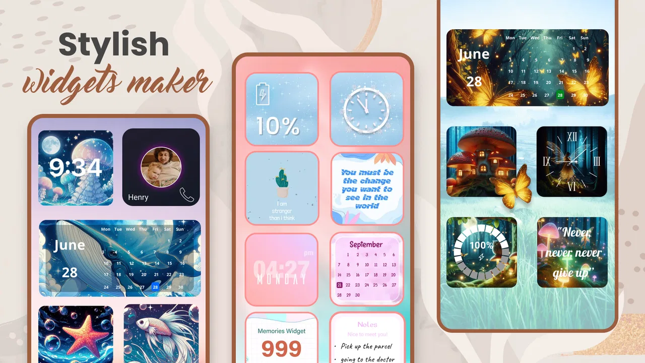
Widget 2026: Aesthetic Widgets
- 4.6
- Rating
- 10.00M
- Installs
- Free
- Price

 Analysis by App-foxy
I spent time with Widget 2026: Aesthetic Widgets as a personalization app rather than treating it as just another decorative download. Its main appeal is clear: it gives an Android home screen a more deliberate look through widgets, which can make everyday information feel easier to notice and more pleasant to live with. I found it most interesting when I used it to support a routine, not simply to fill empty space with a pretty panel.
That distinction matters. A widget can be attractive and still be awkward to read, too busy for a small screen, or difficult to use when I am in a hurry. My experience with this app was therefore a mix of visual enjoyment and practical testing. I looked at how comfortably the interface can be explored, how its decorative approach affects readability, and whether it remains useful for people with different habits, vision needs, motor control, or temporary limitations such as poor lighting and one-handed use.
Developed by GeniusTools Labs, the app is free to install and is aimed at everyone from a content-rating perspective. It supports Android devices starting with version 5.0, so it is not restricted to recent phones. The current version is 85.1.4, and the app has already attracted over ten million installs, with a 4.6 average from around 166 thousand ratings. Those figures suggest that the concept has broad appeal, but they do not remove the need to judge whether the visual style works for your particular phone and daily routine.
You May Also Like

 Blood Strike: 2.5 Anniversary
Blood Strike’s Loadouts Turn Every Drop Into a Tactical Gamble
A close look at Blood Strike’s custom loadouts: how fast access to signature weapons reshapes its battle royale rhythm, rewards preparation, and narrows the gap between fights.

 Pandora - Music & Podcasts
Pandora’s Music Is Easy to Start, but Harder to Recover
Pandora’s strength is its low-effort path from a seed to a station. Its weak spot is how much confidence it asks you to place in connection, setup, and quiet recovery.

 8 Ball Pool
 Is Built on Rivalries, Rematches, and Routine
A close look at the rivalries, rematches, shared routines, and unanswered safety questions that turn a quick pool match into a persistent mobile community.

 Samsung Music
’s Quiet Strength Is Playing What You Already Own
Its reach comes less from spectacle than from dependable access to a personal library. That simplicity is both the app’s strongest retention engine and its ceiling.

 AccuWeather: Weather Radar
AccuWeather Review: A Quick, Clear Forecast for Everyday Decisions
For everyday plans, the best forecast is the one you can understand quickly. AccuWeather makes rain timing, radar, and local conditions easy to act on, with a few trade-offs.

 Hill Climb Racing
Why Hill Climb Racing Still Turns Crashes Into One More Run
A tiny car, a bumpy hill and one more upgrade: Hill Climb Racing keeps resurfacing because its simple chaos makes every near-miss feel personal.
More From Our News Desk



How the home-screen experience affects readability and navigation
I focus on how Widget 2026: Aesthetic Widgets can make home-screen information easier to notice without turning the display into a visual puzzle. The useful question is not simply whether a widget looks good, but whether its placement and styling help me find what I need with less effort. That leads naturally to the everyday choices that shape how readable and navigable the finished screen feels.
A visual starting point that is easy to understand
The first thing I noticed is that Widget 2026: Aesthetic Widgets is built around choice and presentation. Instead of asking me to redesign the whole launcher, it focuses on adding a more expressive layer to the home screen. That makes the idea approachable for someone who wants a change without learning an entirely new Android environment.
For a new user, the sensible workflow is to begin with one widget and judge it in the place where it will actually live. I would not fill every available area immediately. A single panel gives me a better idea of whether the text remains comfortable at a glance, whether the colors compete with app icons, and whether the home screen still feels calm when I unlock the phone repeatedly throughout the day.
The app is easier to appreciate when I treat the widget as part of an information hierarchy. The most important item should occupy the clearest visual position, while decoration should remain secondary. If a design makes me pause to interpret it, it may be attractive but less useful than a plain Android widget. That is one of the central trade-offs here: the app encourages a curated look, while practical navigation often benefits from restraint.
Readability depends on the surrounding screen
Accessibility is not only a property of the widget itself. Wallpaper contrast, icon placement, screen brightness, font scaling, and the distance between the phone and my eyes all change the result. A design that looks clear in a preview can become less comfortable over a bright photograph or a visually detailed background. I recommend checking the final home screen in daylight and in a dim room rather than trusting the setup view alone.
People who use larger text or display magnification should test the complete arrangement carefully. Increasing system text can affect the balance of a home screen even when the widget remains technically usable. I found that a spacious layout is more forgiving than one that relies on tiny labels, narrow gaps, or several decorative elements packed together.
For users with color-vision differences, relying on color alone is a weak design choice. A calendar-like distinction, status cue, or category should ideally be supported by wording, shape, or position as well. I would select the clearest available design rather than the most fashionable one, especially if I need the widget to communicate information quickly.
Navigation is simple, but personalization still takes patience
The basic concept is less intimidating than a full launcher replacement, but personalization can still become time-consuming. The temptation is to keep comparing styles instead of deciding what genuinely improves the home screen. I got better results by choosing the purpose first: a quick glance at a routine, a visual accent around existing icons, or a more organized starting point for the day.
This approach also helps users who find dense interfaces tiring. Rather than exploring every option, I would make one change, return to the home screen, and use the phone normally for a while. That reveals problems that are easy to miss during setup, such as a widget being hidden by a hand, competing with notifications, or requiring too much visual scanning.
The most useful accessibility habit is to judge the finished home screen, not the attractive preview. This is particularly important with an aesthetic-focused app because the presentation can make a design feel clearer than it is during real use.
Motor, sensory, and situational considerations
I also consider how the same setup feels when my hands, attention, or surroundings make phone use harder than usual. A layout that works at a desk may be less practical while walking, holding something, or coping with glare, so I look at ways to reduce precision and visual demands. Those situations matter as much as the initial design choice when judging whether personalization is comfortable over time.
Why fewer changes can help with motor effort
For someone with limited dexterity, tremor, joint pain, or one-handed use, the benefit of a widget is often reducing the number of steps needed to reach familiar information. A well-placed panel can make the home screen more useful without requiring repeated navigation through menus. The advantage is strongest when I position it where my thumb naturally rests and avoid creating a layout that demands precise taps between neighboring icons.
At the same time, customization itself can involve repeated dragging, resizing, and repositioning. That may be tiring for users who have difficulty with sustained touch gestures or accurate placement. I would set up the design while seated, use both hands if possible, and stop once the arrangement is functional. The app is not automatically easier just because the final result looks simpler.
A spacious home screen is also more forgiving. Leaving breathing room around a widget can reduce accidental taps and make it easier to identify the intended target. This is a practical reason to resist filling the screen with multiple aesthetic elements. The cleanest arrangement is often the one that asks the least from my hands.
Sensory comfort is highly personal
Visual style can be calming for one person and overstimulating for another. Decorative layouts, strong contrast, or a busy collection of panels may make the phone feel lively, but users sensitive to visual clutter may prefer a single muted element. I would consider the home screen a daily sensory environment, not a one-time image, and choose something that remains comfortable after dozens of glances.
People who experience eyestrain may benefit from testing the widget with the phone's normal brightness and display settings rather than maximizing brightness to make a design pop. A softer background and clear text may be more sustainable than a dramatic combination that looks impressive in a screenshot. If a widget makes me squint, I would remove it even if it is the most attractive option available.
Those who use screen readers or other Android accessibility services should keep their usual setup active while testing. A visual widget may not offer the same value to someone who primarily accesses information through spoken feedback, and the decorative layer should not replace a more direct accessible route. In that situation, I would keep essential information available through the phone's standard apps and use this app only for optional visual personalization.
Everyday situations reveal its real strengths
One realistic use case is a morning routine. I can place a widget on the first home screen so that the phone feels less scattered when I wake up. Instead of opening several apps simply to orient myself, I get a visual starting point and then move to the task I actually need. The benefit is not that the widget does everything; it is that the first screen can feel more intentional and less mentally demanding.
Another situation is using the phone while carrying groceries or commuting. One-handed use, glare, movement, and limited attention make small decorative details less valuable. In that context, I would favor a large, uncluttered placement and avoid relying on subtle colors. If the design requires careful interpretation, a conventional Android shortcut or standard widget may serve me better.
For someone working from home, a personalized home screen can create a gentle separation between a work arrangement and a more relaxed personal arrangement. The app is useful here as a visual cue, provided the design does not become another source of distraction. A restrained layout can mark the beginning of a routine; a constantly changing collection may encourage unnecessary tinkering.
How it compares with ordinary alternatives
The usual Android widgets are generally better when my priority is direct information, predictable behavior, and consistency with the operating system. They tend to make sense for users who want a calendar, clock, weather panel, or shortcut without spending much time on appearance. Widget 2026: Aesthetic Widgets is more appealing when the home screen itself matters as part of my personal style.
A launcher replacement can offer deeper control over icons, gestures, grids, and navigation, but that broader power also introduces more decisions and a larger adjustment period. This app occupies a middle ground: it can change the character of the home screen without asking me to rebuild the entire phone experience. That is convenient for casual personalization, though it may feel limited to users who want complete control over every visual and functional detail.
Static wallpaper is simpler and usually creates fewer usability questions. It changes the mood of the phone without adding another information layer. I would choose wallpaper alone if I want decoration with minimal setup, while I would choose this app when I want the decorative treatment to occupy a more active role on the home screen.
Remaining barriers and the cost of an attractive setup
Finally, I weigh the effort and spending involved in keeping an attractive setup genuinely useful. The app is free to install, but optional purchases and the time spent comparing designs can change the experience, especially for someone who only wants a quick, dependable home screen. I’ll use that balance to consider who gets lasting value from customization and who may be better served by simpler Android tools.
Visual appeal can compete with clarity
The biggest limitation is inherent to the concept. Aesthetic customization often rewards style, while accessible design rewards clarity and consistency. Those goals can overlap, but they do not always do so. A widget with delicate text, low-contrast colors, or crowded decoration may look polished and still be tiring for someone with reduced vision.
I would also be cautious about assuming that a design remains equally readable across different Android phones. Screen size, resolution, display settings, launcher behavior, and wallpaper can change the experience. A layout that feels balanced on one device may feel cramped on another. The safest approach is to test the exact device and keep a standard alternative available if the widget becomes inconvenient.
Free access does not mean every choice is frictionless
The app is free, but it includes optional in-app purchases ranging from $0.99 to $99.99 per item. That range makes it important to pay attention during customization and distinguish between what is available without payment and what belongs to an optional purchase. For a user on a tight budget, the free experience should be evaluated on its own rather than assuming that every appealing design is included.
This also affects recommendations for children and shared devices. The Everyone age rating makes the app broadly suitable in content terms, but purchase awareness still matters when a device is used by more than one person. I would keep purchase controls in mind and avoid letting a child explore a customization screen without supervision if accidental spending is a concern.
Who should skip it
I would skip this app if I want the most functional home screen possible and have no interest in visual customization. Standard Android tools are likely to be quicker and more predictable for that purpose. I would also hesitate if I depend heavily on large, high-contrast information and cannot accept experimenting with different layouts.
It may not be the best fit for someone who expects a full launcher replacement, advanced automation, or complete control over the operating system's navigation. Its strength is the aesthetic layer, not replacing every part of the phone. Users who prefer a fixed setup may also find the abundance of visual choices more distracting than helpful.
On the other hand, I think it is a good match for someone who wants a friendlier-looking home screen, enjoys small design changes, and is willing to test readability instead of choosing purely by appearance. It can also suit people who benefit from a visible routine cue, as long as essential information remains available through conventional Android controls.
An inclusive verdict for everyday personalization
My overall impression is that Widget 2026: Aesthetic Widgets succeeds when I use it selectively. It gives Android personalization a more expressive feel and can make the first screen of the day more inviting. The app's broad device support, free entry point, and straightforward concept make it approachable, while its popularity shows that the idea resonates with many users.
Its inclusive value is more conditional. I would not describe it as an accessibility solution, because visual customization alone cannot address every need. Instead, I see it as a tool that can support different contexts when I keep contrast, spacing, text size, hand position, and sensory comfort in mind. The same widget that helps one person orient themselves may create clutter or strain for another.
My practical recommendation is to begin with the least decorative option that still feels personal. Place one widget on the main screen, check it in bright and dim conditions, try it with your normal text settings, and use the phone one-handed before adding anything else. If it remains clear after that test, the design is earning its space. If it does not, a standard Android widget or simple wallpaper is the better choice.
For me, the app is worth trying because it offers a middle path between doing nothing and replacing the entire launcher. I would recommend it to friends who want a more considered Android home screen, especially those who enjoy visual organization but do not want a complicated system. I would also tell them not to confuse attractive with accessible. Its best result comes from treating appearance as support for a routine, never as a substitute for clear and comfortable access.
FAQs for Widget 2026: Aesthetic Widgets
01What are the main features of Widget 2026: Aesthetic Widgets?
Widget 2026: Aesthetic Widgets offers a wide range of customizable widgets for your home screen. Users can choose from various clock styles, weather updates, calendar layouts, and more. The app also provides extensive themes and color palettes, allowing for a truly personalized aesthetic that matches your style.
02Is Widget 2026 compatible with both Android and iOS devices?
Yes, Widget 2026: Aesthetic Widgets is designed to be compatible with both Android and iOS platforms. The app offers seamless integration with the operating systems, ensuring that all features and customizations work smoothly regardless of the device you're using.
03How customizable are the widgets in Widget 2026?
The widgets in Widget 2026 are highly customizable. Users can adjust sizes, colors, fonts, and even the information displayed. Whether you prefer minimalist designs or vibrant displays, the app allows you to tweak each widget to fit your personal preferences and enhance your device’s look.
04Does Widget 2026: Aesthetic Widgets require a subscription for full access?
While Widget 2026 offers a free version with basic features, access to premium themes and advanced customization options may require a subscription. The subscription model ensures users can unlock exclusive content and receive regular updates, enhancing the overall user experience.
05How user-friendly is Widget 2026 for beginners?
Widget 2026 is designed with user-friendliness in mind, making it accessible for beginners. The app features a straightforward interface with intuitive navigation. Additionally, it provides tutorials and tips to help new users understand how to customize and optimize their widgets effectively.
Pros
- Highly customizable widget options.
- User-friendly interface for easy setup.
- Seamless integration with existing apps.
- Regular updates with new features.
- Minimal impact on device performance.
Cons
- Limited free design templates available.
- Some features require in-app purchases.
- Occasional bugs in older devices.
- Limited support for non-standard screen sizes.
- Customization can be time-consuming.

Widget 2026: Aesthetic Widgets
Gallery